
Value Contrast is measured as the ratio of the Light Reflectance Values (LRV) of two colors. LRV is the percentage of light that arrives at a surface and is reflected back to the viewer. Contrast can help users identify obstacles and read visual cues about a space. For many low vision users, particularly those with Macular Degeneration or Cataracts, the central portion of vision is decreased. Reduced central vision is often correlated with reduced color discrimination as this is the part of the retina with the highest concentration of color receptors called cones. Increasing value contrast, not color contrast, can have greater impact on visibility. Two colors that are opposite on the color wheel such as red and green may have the same value when seen in greyscale. Varying their value can improve visual recognition for users.
Ambient light levels affect how our eyes adjust to the visual scene. Low light means a lower ability to adapt to changes in light level. High light levels contribute to greater range of discernment of detail.
Edge Detection requires combining visual cues from color and shadow. Level changes without visual cues are hazardous. Patterns and reflections degrade contrast and visual cues.
Light Reflectance Value: Scale from 0 (black) to 100 (white). For quick reference, paint manufacturers list this information on their fan decks.
The Lighting for Aging guideline produced by IES recommends 75-90% LRV for ceilings and 60-80% for walls.
LRV ratio between architectural components should be at least 30 points. For smaller objects, 70 points is better.
What are the safety or task requirements of the space? How does the task contrast with its background? Increasing contrast in accessibility features like signs, handrails, and door/base trim from their surroundings can help users of all abilities make wayfinding decisions and accomplish tasks more confidently.
Eliminate invisible obstacles and safety hazards by improving contrast and visual cues.
(For more information see the Appendix on LRV)
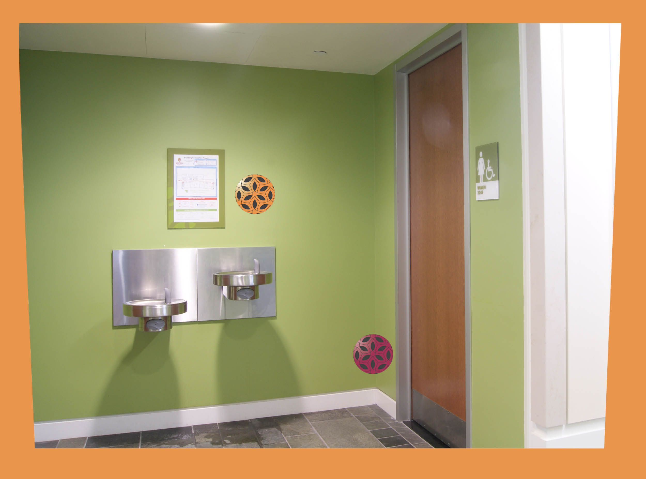
The ADAAG provides guidelines for signage in section 703.5.1. They do not make a recommendation for value contrast but a 70 point difference in light reflectance values is considered best. In Psychophysics of Reading VI, Rubin and Legge found that reverse contrast signs (dark background with white letters) reduce pre-retinal scatter and make the signs easier for some people to read. Overhead wayfinding should be repeated at eye level nearby. Signage in dark areas should be back-lit or accented with additional task lighting.

Monochromatic color schemes allow objects to hide in their surroundings. When a user with limited vision encounters low contrast scenes, objects can disappear. This situation is commonly found in bathrooms and stairwells. These are places most users visit. Monochromatic scenes with dim and uneven lighting inhibit the ability to detect edges.
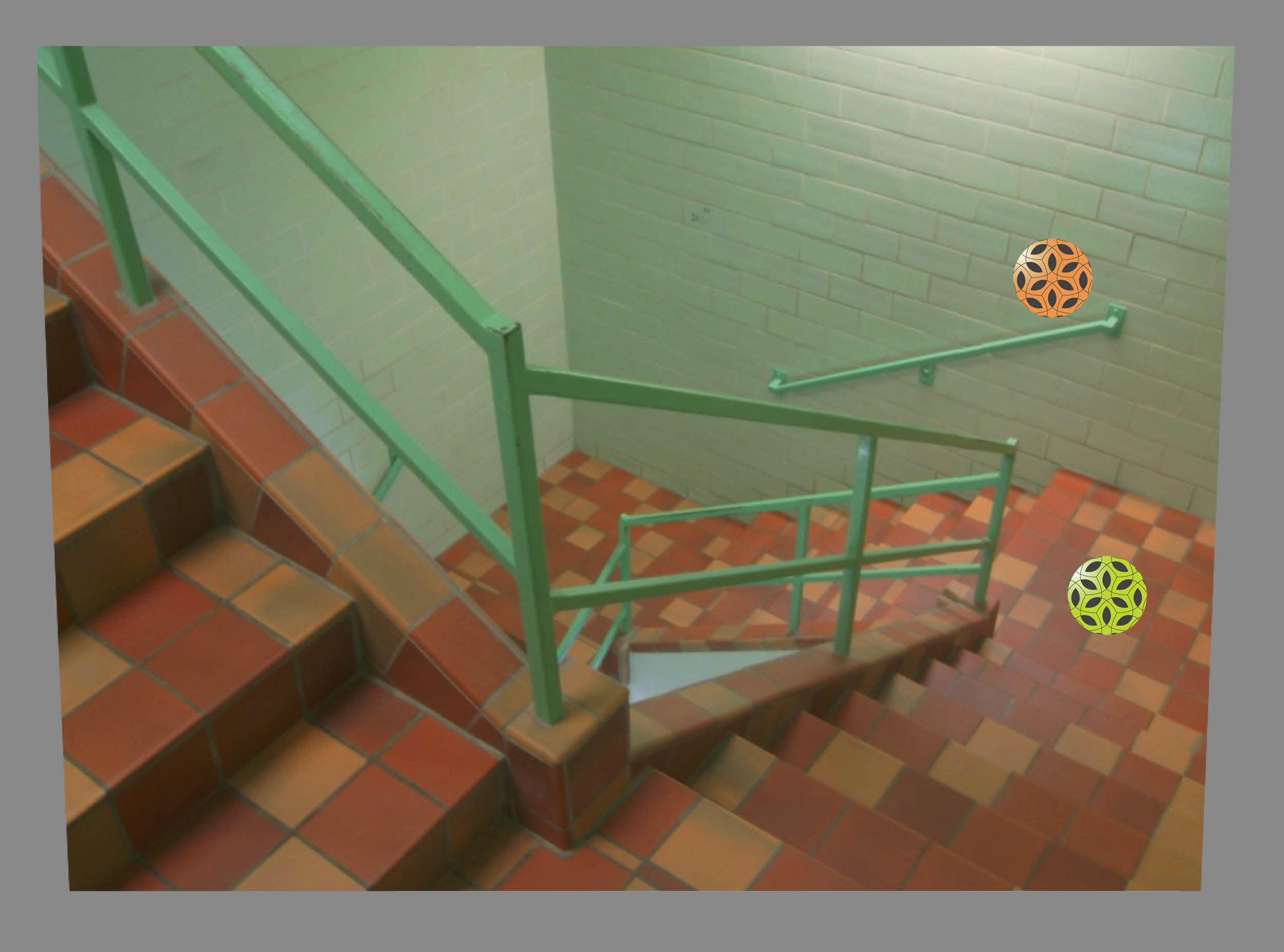
Stair treads, risers, and stringers are often uniform colors making it difficult to distinguish edges. In these situations physical texture is not enough to identify changes in elevation for the visually impaired. In bathrooms, white walls and fixtures blend together and white lavatory bowls blend into white counters. Modern monochromatic office spaces inhibit wayfinding and orientation by removing visual cues.
![]()
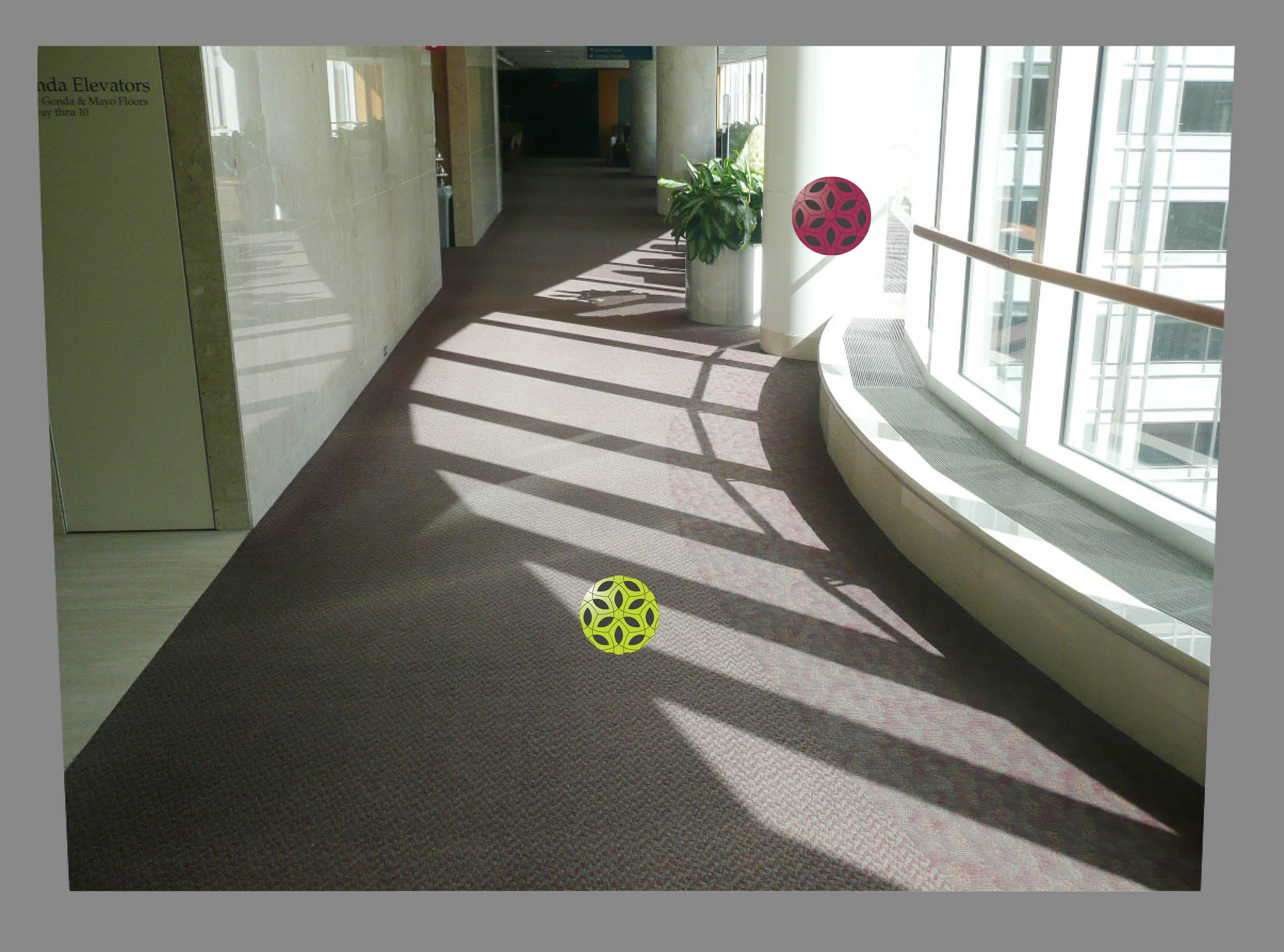
Reflective flooring muddles the visual cues allowing features to blend.
![]()
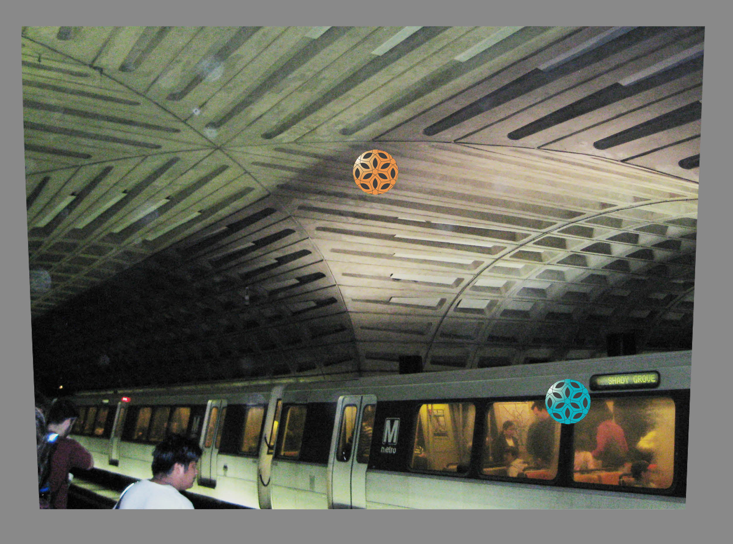
Overhead obstacles without identifying edges are invisible hazzards.
![]()
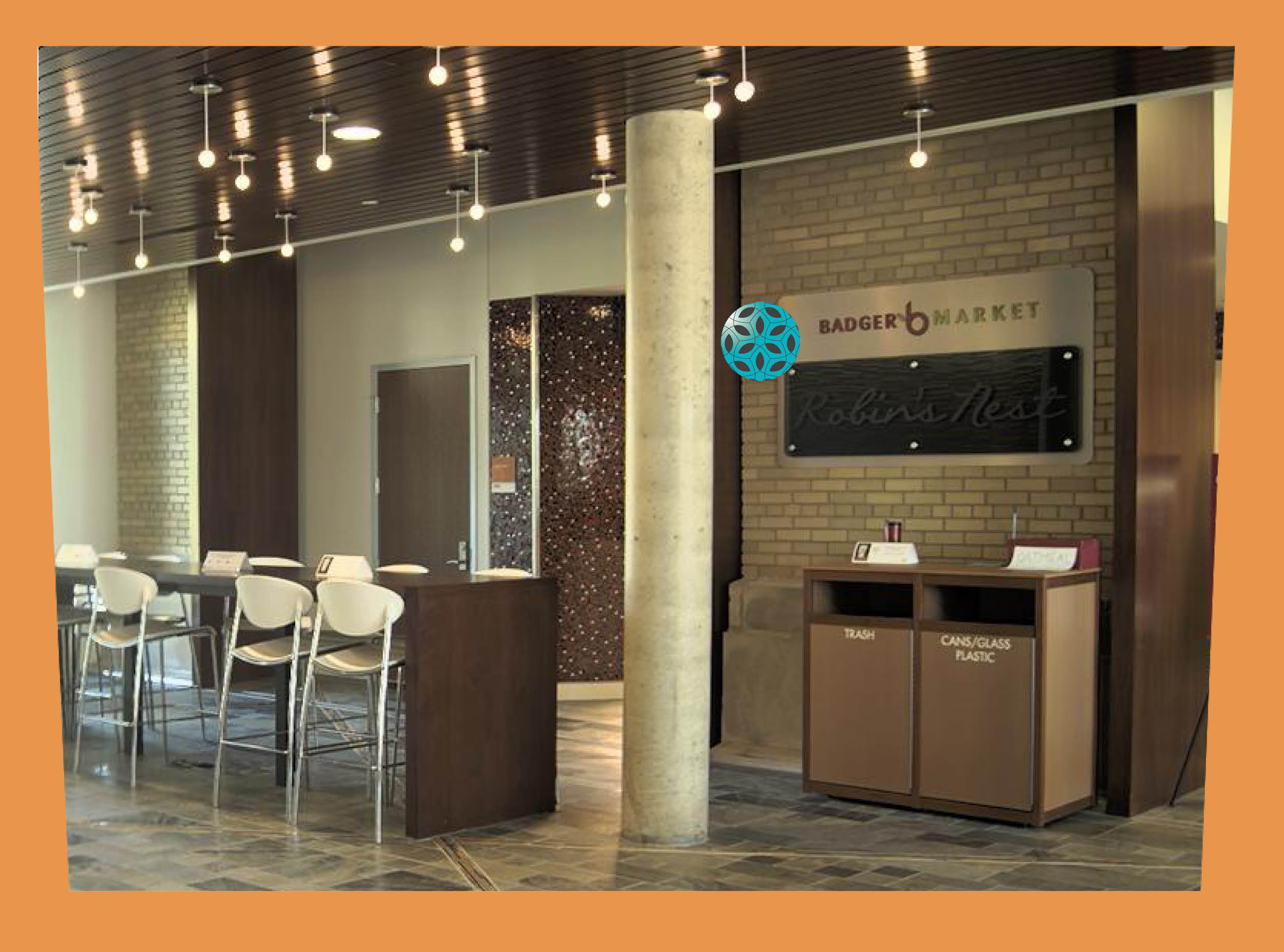
Signage contrasts with wall materials and is located at eye level.
![]()
Door edge and wall base clearly define this space.
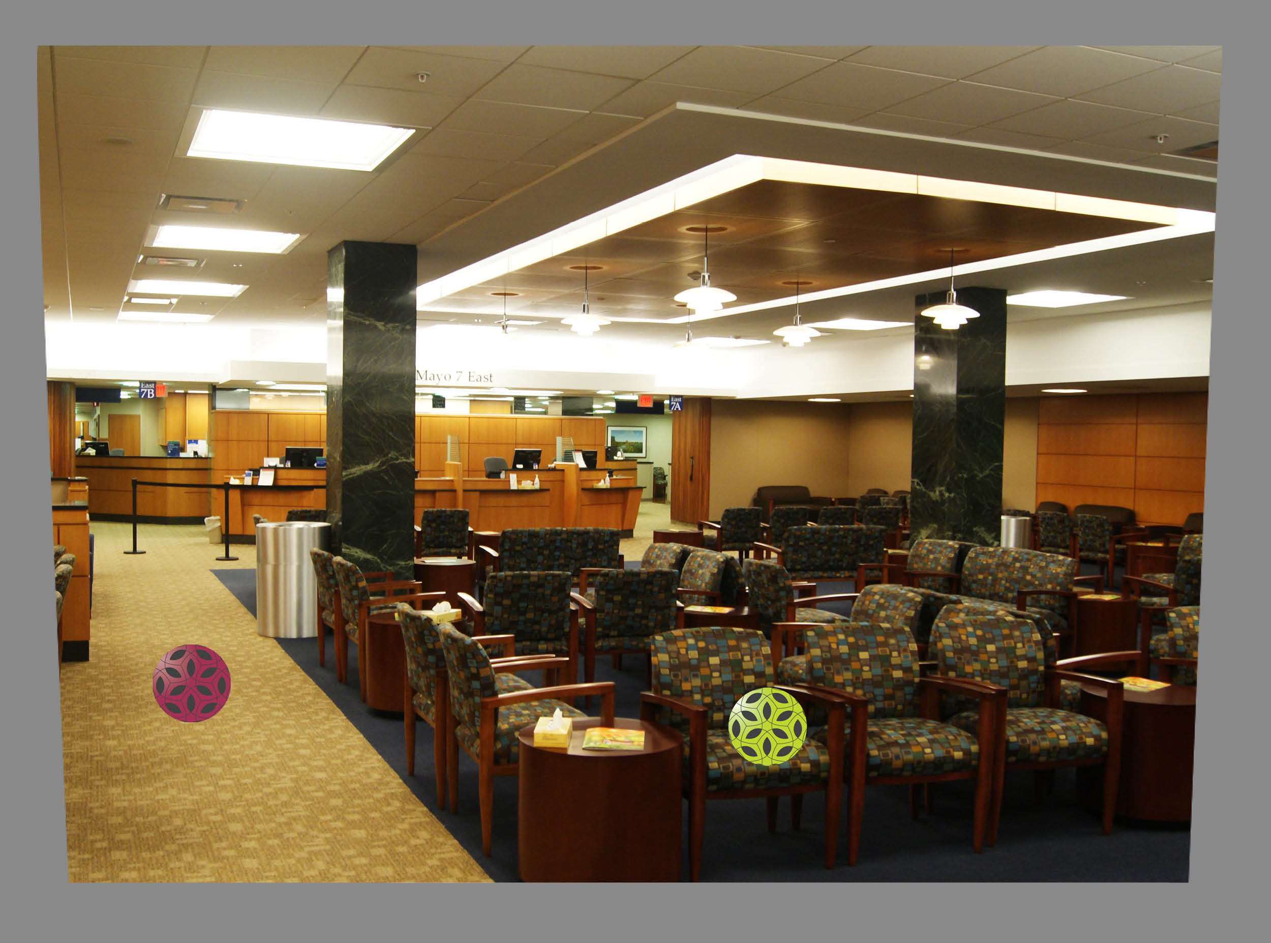
Visual clutter can make a space more confusing. Excessive patterning in surface materials can lower contrast between objects and their surroundings. A surfeit of visual information like a casino floor with lights, colors, and sounds can produce the same effect. Even a small amount of visual clutter in a space for high acuity tasks like navigating stairs can be a safety hazard.
High pattern carpets are inappropriate for stairs and ramps. They camouflage elevation changes and edges. Freestanding lobby furniture such as ottomans and low tables can become tripping hazards. Highly patterned furniture, workstations, and flooring materials can be visually disorienting when used in concert.
![]()
This floor pattern could be successful if the dark carpet defined the path and the light color defined the seating.
![]()
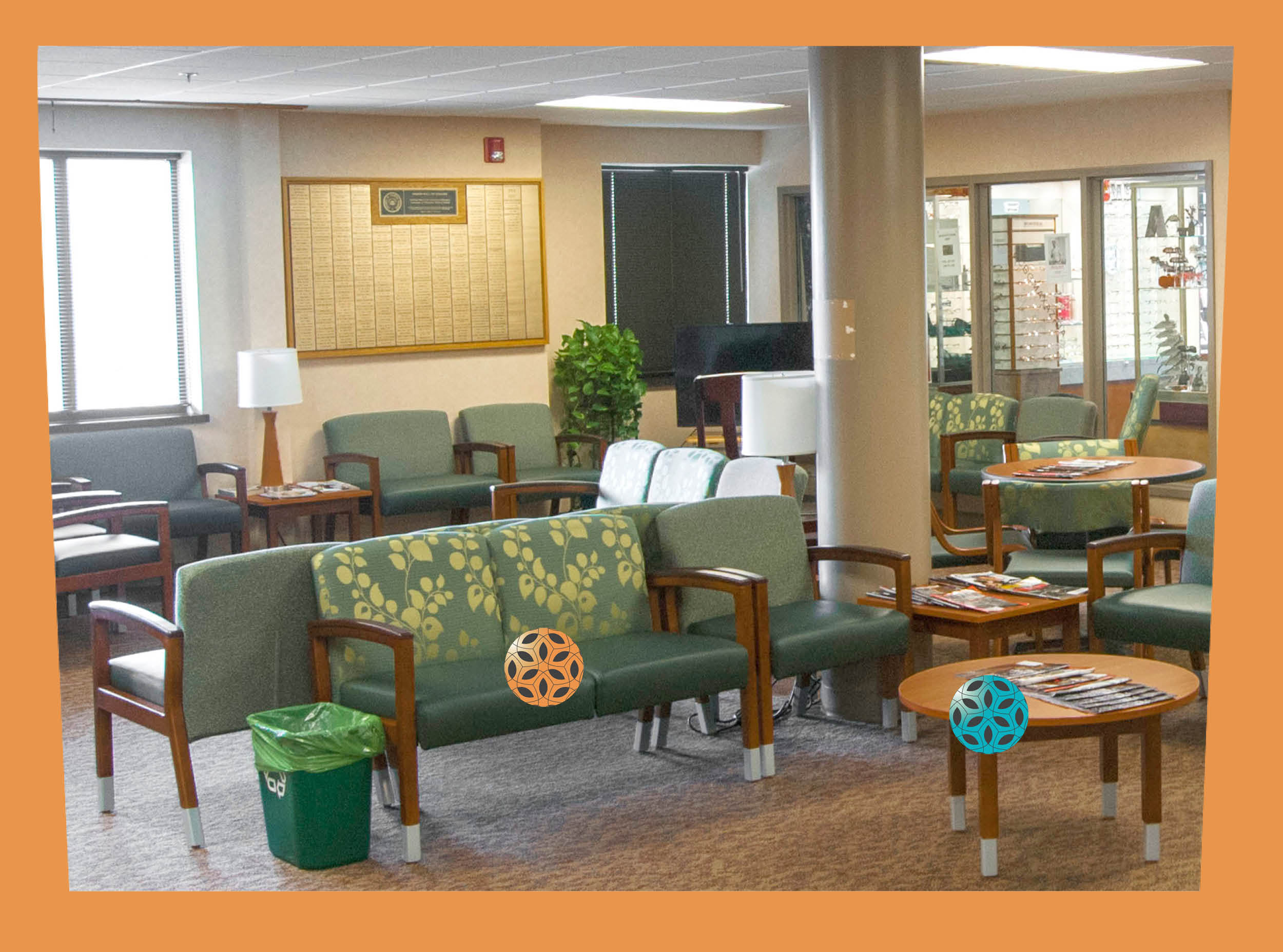
These seats blend in with the floor making furniture a trip hazzard and sitting difficult.
![]()
Green seats provide value contrast between floors and walls.
![]()
Table could be more visible with contrasting edge.
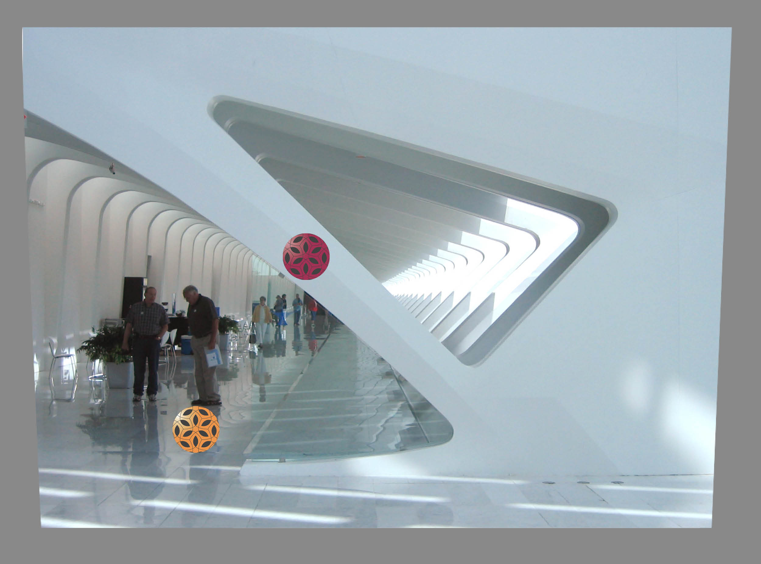
Reflective surroundings create confusing visual environments. Highly reflective surfaces like glass are often used to make spaces seem bigger by reflecting daylight and ambient light. The reflective surfaces can confuse the visually impaired who can’t distinguish the real obstacles from the reflected ones.
Misleading reflections from interior and exterior materials can be disorienting. Large walls of glass can hide the exit in an emergency or reflect glare. Water is particularly problematic as it may appear to be a reflective floor surface. Glass that reaches the floor can be mistaken for a doorway or a person walking towards you.
![]()
Irregular wall shapes, lighting patterns and reflections confuse this visual scene.
![]()
Lack of visual cues about door swing made this small "push" sign necessary.
![]()
A change in pattern and brightly colored signs help identify this door in a reflective wall.
Misleading contrast can confuse users where floor and wall coverings mimic steps or other elevation changes. Visually impaired persons use value contrast as visual cues. Misleading cues are disorienting and will discourage users from trying to move independently. Good visual cues can make navigation easier and safer for everyone.
Misleading patterns and color contrasts are confusing, especially where the color change is perpendicular to the path of travel. Broad steps or color changes along the length of a ramp are particularly hazardous. Wall patterns and uneven lighting hide or mimic doorways and create shadows that pretend to be other building features.
![]()
This mullion shadow looks like steps.
![]()
Luminance contrast between exterior and interior views creates glare.
![]()
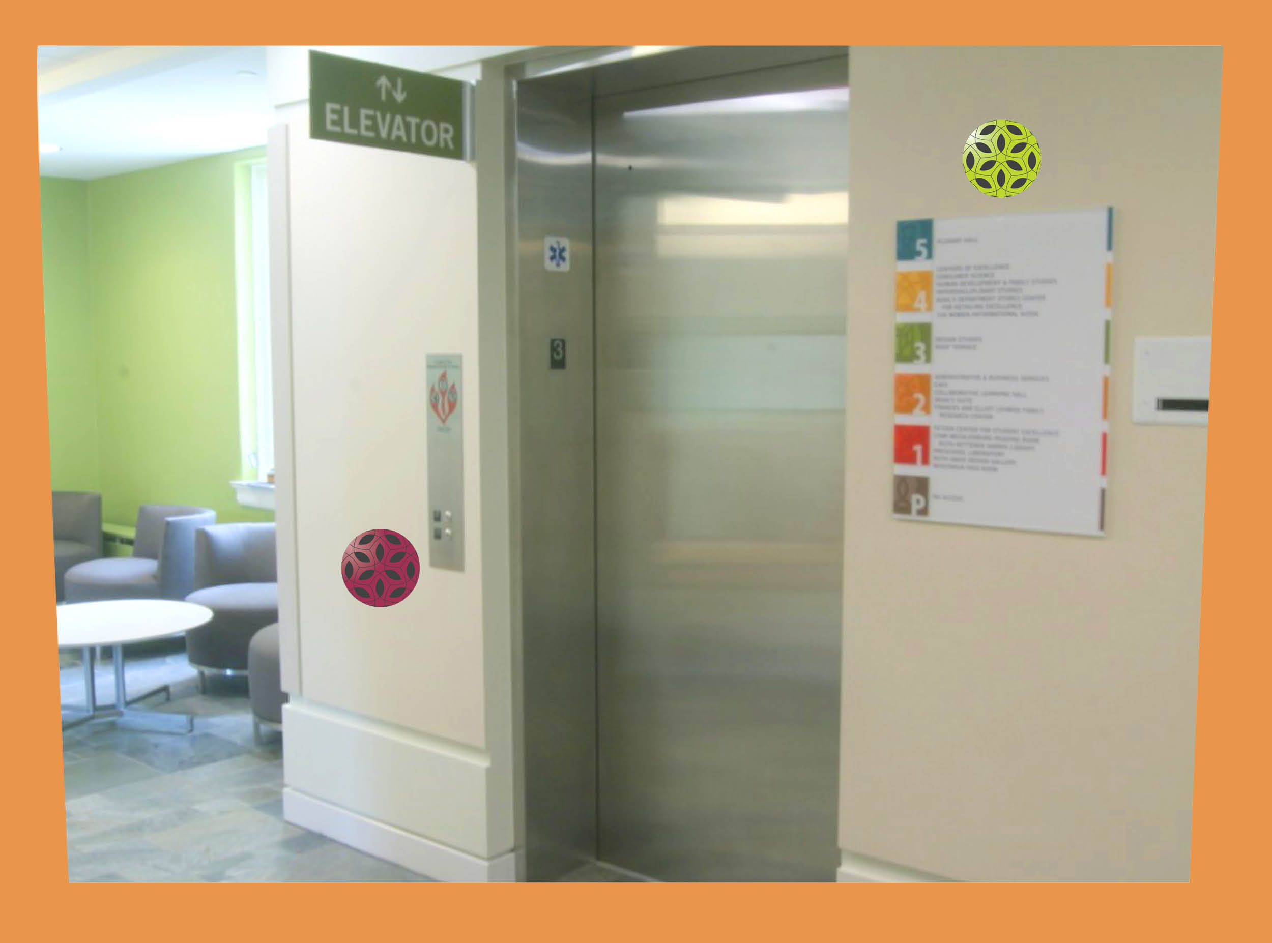
Elevator call buttons are easy to find.
![]()
Bright signage with large text contrasts with the wall.

Low Contrast with low light levels can reduce the ability to distinguish between colors, detect edges, and read visual cues about the environment. Lower light levels also reduce the ability to adapt to higher light levels increasing the possibility for glare. Mood Lighting is commonly found in bathrooms, movie theaters, restaurants, and elevators.
Elevators with low lighting, reflective surfaces, and low contrast buttons are traps for low vision users. They feel around to find the buttons or wait for someone to offer help. Theatre aisles with dim lights cause difficulty finding seats and distinguishing steps, and a restaurant with mood lighting can be a navigation nightmare.
![]()
Up lighting on a dark surface does not reflect enough luminance back to the visual plain.
![]()
Poorly maintained signage doesn't provide enough contrast for readability.
![]()
Daylight and multiple types of fixtures light this space with interesting layers of light.
Visual and tactile changes can signal the user to be aware of a change in the environment they are trying to navigate. Shadows denote steps, texture can signal a ramp, color and lighting changes might suggest depth. Use material color and texture carefully to signal changes in the environment such as at ramps, handrails, stairs, signage and controls.
Lack of detectable warning makes a user work harder to find the visual cues they need to move around safely. Spaces with low light or monochromatic colors make it harder to find these cues. Without warnings stairs, ramps, rugs, furniture, and free-standing signs become invisible hazards.
![]()
Hand rails with low contrast from walls are difficult to see.
![]()
Patterned materials on stairs can hide edges and reduce contrast cues.
![]()
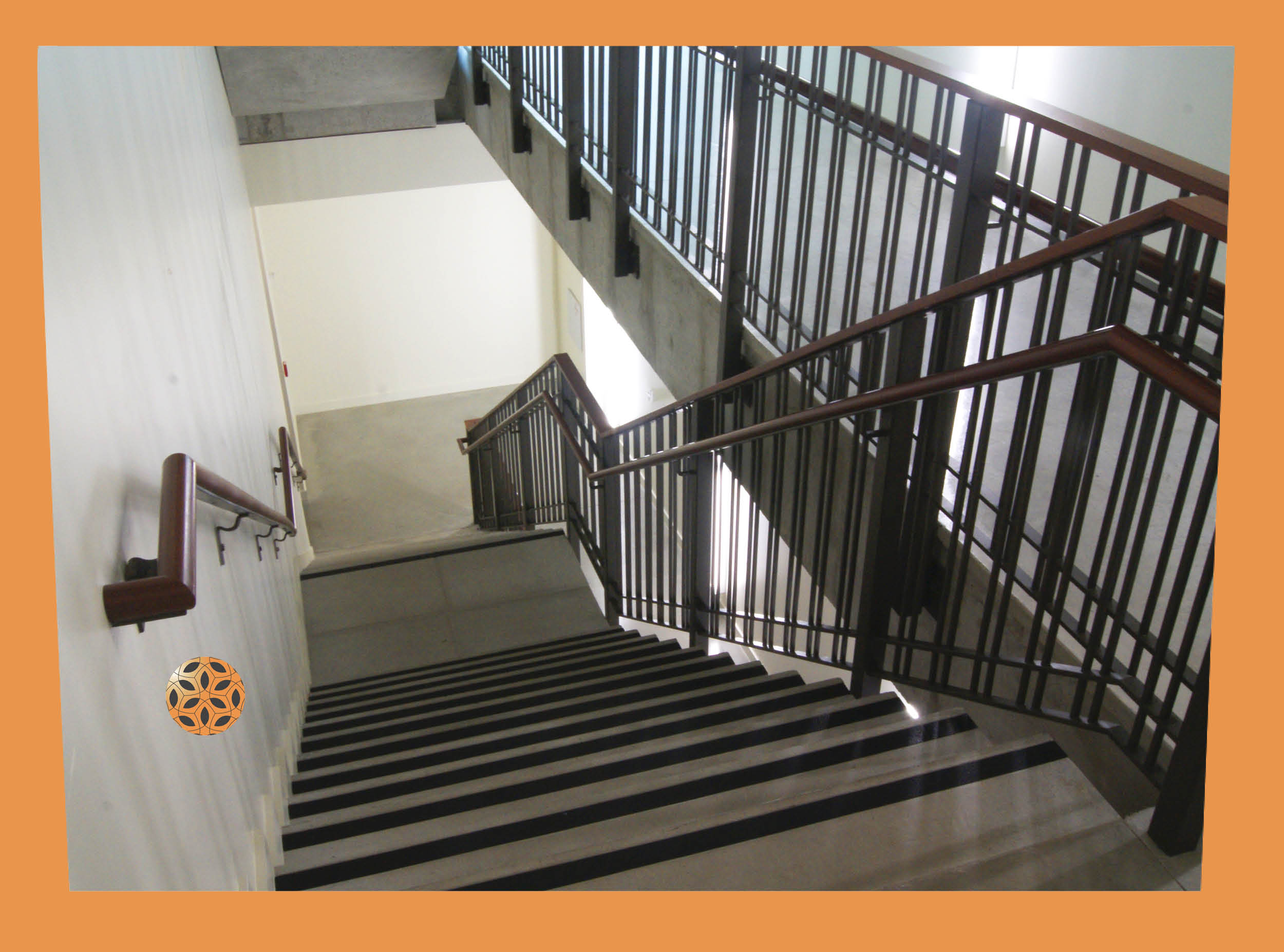
High contrast railing and stair edge clearly show the boundaries of the stair.