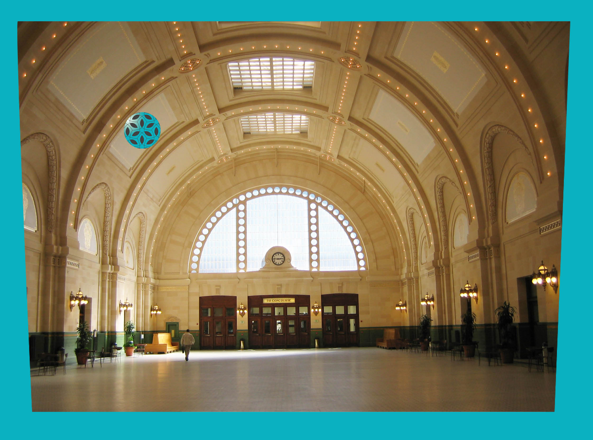
Light placement affects the contrast and color rendering of interiors. Uneven lighting can create false shadows that hide edges and obstacles. Ideal lighting is diffuse, up-lighting with adjustable task lighting. Additional lighting can create intentional shadows with good contrast for navigation.
Poor lighting layouts can create uneven illuminance levels with strong contrast between light and dark and shadows that hide important features. Down lights and directional lights with strong cutoff angles contribute to these shadows. Poorly aimed lights can reflect off surfaces and back at users, degrading the visual field. Daylight changes throughout the day are often not anticipated or properly controlled.
Candlepower distribution maps for light fixtures can be used to design a lighting plan. Work with a lighting designer to develop a holistic plan suitable to each environment. Reference the IES Handbook for recommended light levels for each project and area type. Lighting for seniors generally requires more light. ASHRAE 90.1-2013 allows higher lighting power densities for spaces primarily used by seniors and those with visual impairments. See table 9.6.1 in that document for more information.
Down lighting typically has a sharp cutoff angle that hits lower on the wall than a fixture with an up/down design and may make may scalloped lighting effects on the wall. If upgrading existing T12 luminaires to a T8 or T5 lamp, consider re-calculating the lighting layout to avoid harsh lighting effects. Consider adjacent materials & potential reflections when planning fixture placement. Try to plan for even illuminance on the walls, not just the floor.
Ambient lighting can be created with fixtures that bounce light off the ceiling and diffuse it into the space. Because it is indirect there is less opportunity for reflected glare. Task lighting provides additional light where it is needed at the work surface, stair edge, or key pad. Ideally, this light is adjustable by the user. Sparkle is that pop of accent light that identifies landmarks and adds interest to the scene. These features should be carefully controlled for glare.

Transition zones provide adjustable lighting between the interior space and changing exterior light levels throughout day and night. It can take seven minutes or longer for eyes to adjust from bright exterior spaces to dimly lit interiors. Space needs to be provided for the visually impaired to step aside while their eyes adjust so they can continue to navigate safely.
Building plans and lighting designs do not account for changing light levels in daylight spaces. Lack of seating or space to step aside while the eyes adapt can make a user uneasy in a busy circulation space. Dim corridors and elevators leading away from the lobby do not have adequate lighting. Elevators are a common transition zone that do not have high enough light levels.
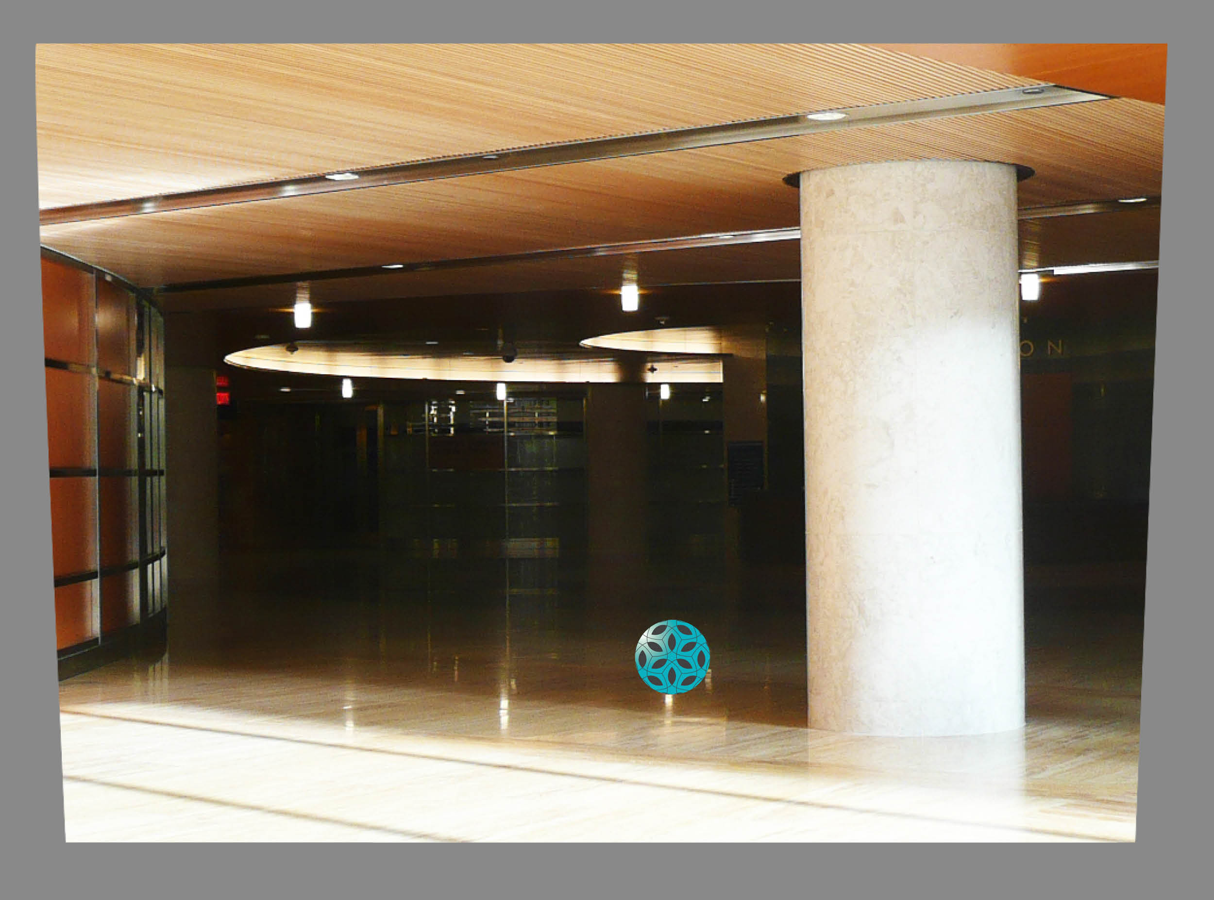
![]()
Inadaquate lighting in transition zones creates cave-like spaces.
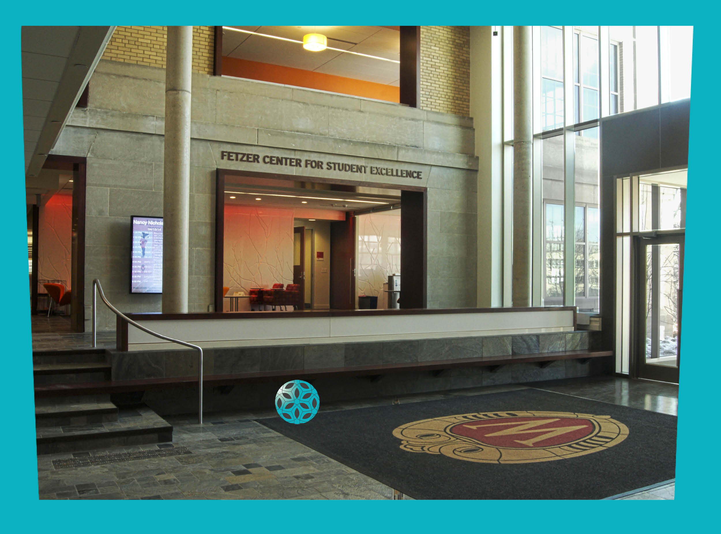
![]()
Seating near the entrance and architectural features create natural transitions.
Shadows from window mullions change throughout the day causing unpredictable patterns. Shadows are a visual cue for those with limited eye-sight. They are generally predictable and suggest change in elevation or some other obstacle is nearby. When strong shadows occur in circulation areas, navigation can be precarious and uncomfortable.
Strong shadows cast on flooring and in circulation areas can be confusing. Regular shadows, such as those cast by window mullions can mimic steps and be treacherous in unfamiliar spaces. Shadows from exterior windows are often unpredictable and change as the sun moves throughout the day and year.
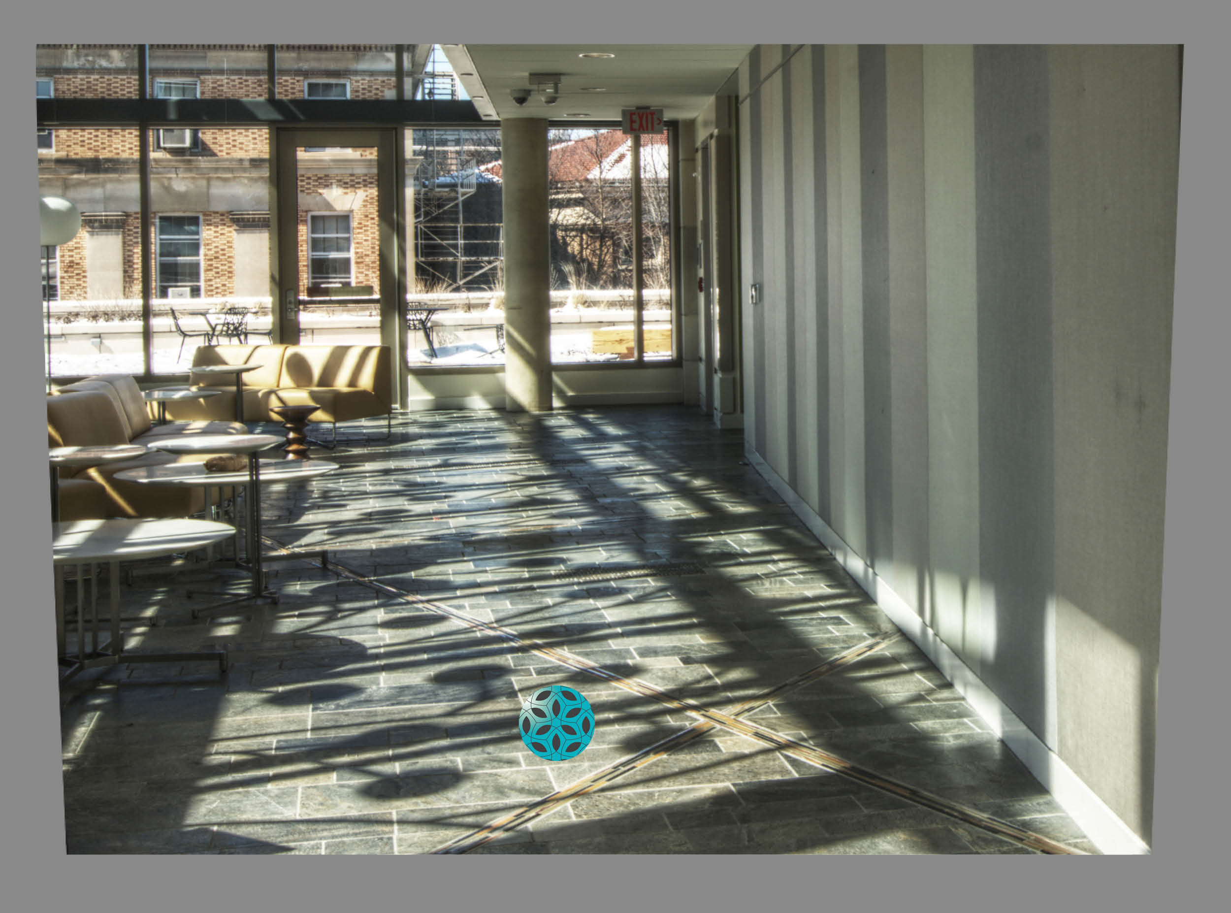
![]()
Complicated patterns and strong sunlight on textured floors make this path visually confusing.
![]()
Daylight with ambient artificial light reduces shadows in circulation paths.

Uneven light distribution makes it hard to see obstacles hidden by shadow or washed out by intense light. Adaptation to low light levels makes strong accent lights glaring. Providing even light with points of higher light as accent can provide wayfinding cues and areas of interest. Task lighting can then be used to supplement the general lighting as necessary.
Pools of light in an overall dim lighting environment can obscure the visual field and make navigation difficult. The eyes adapt to the brightest spot and low vision users become concerned about what obstacles might be hiding in the dark. Bright spots may also cause reflective glare. Uneven lighting often leaves shadows at signage and doorways where good lighting for identification is crucial.
![]()
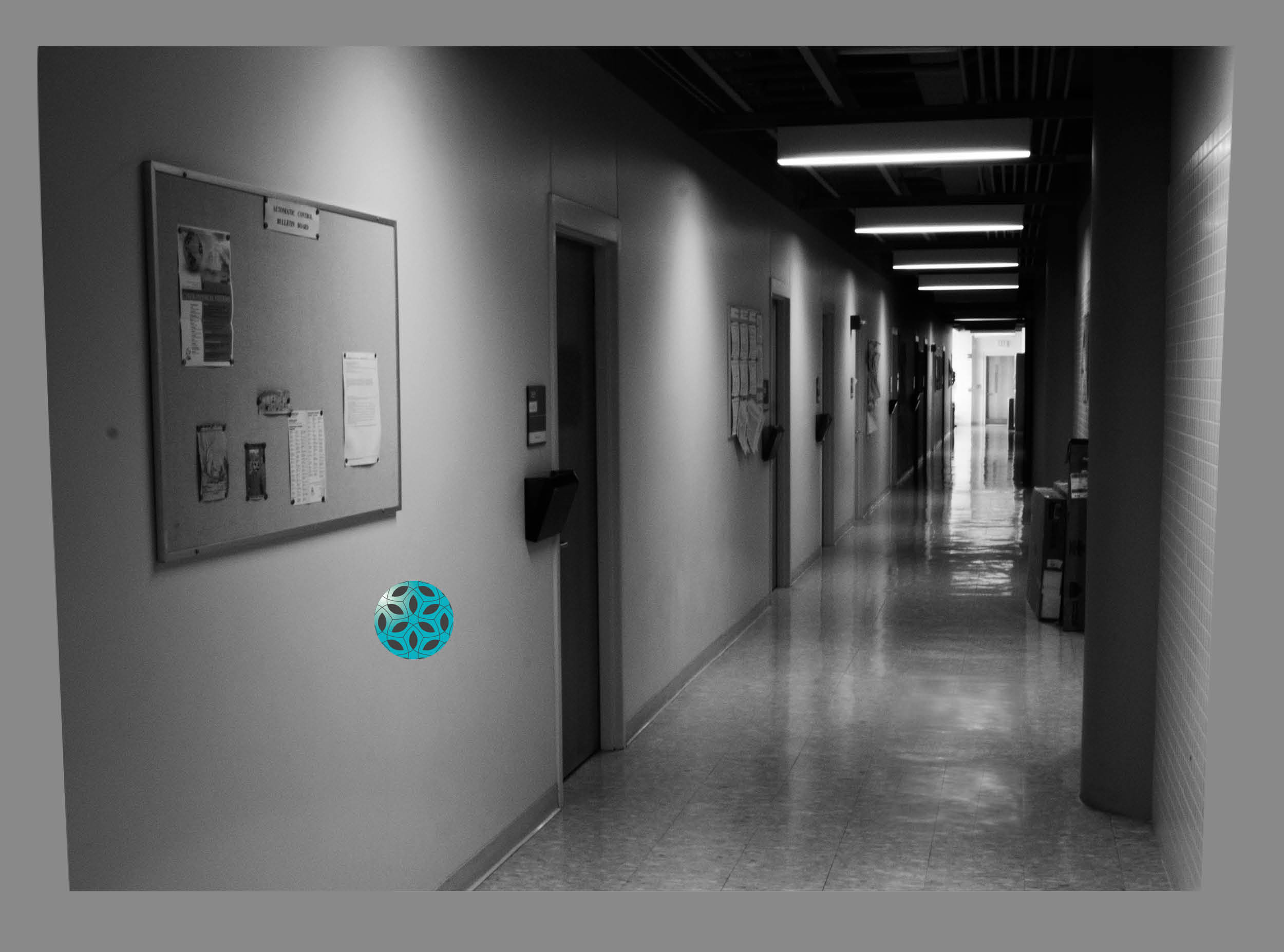
This gray scale image helps better identify the contrast caused by uneven lighting on the walls.
![]()
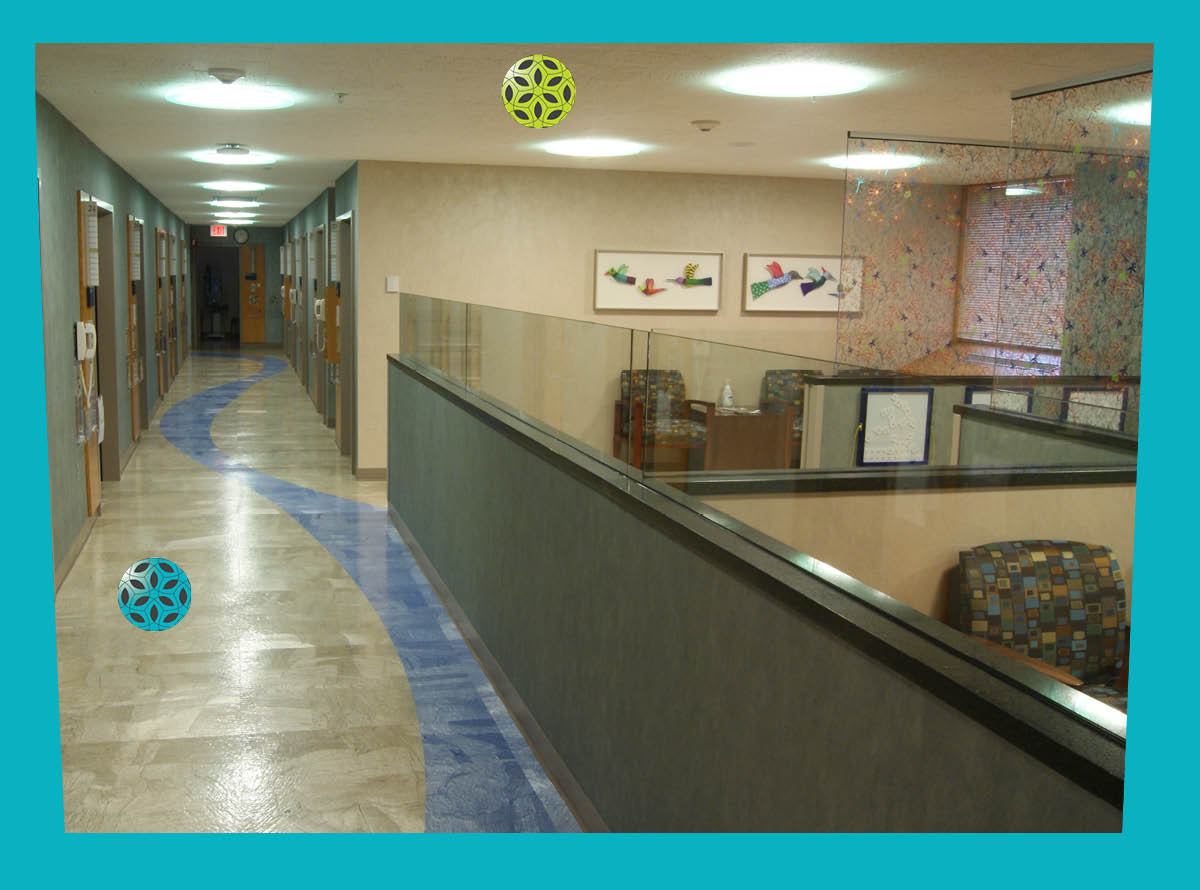
Subtle floor texture reduces reflections.
![]()
Diffuse light fixtures with exterior views create even lighting along a hallway.
