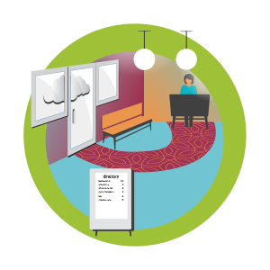
Object location is important in unfamiliar environments. Consistent, repetitive placement of signage and landmarks aids wayfinding. Doorways and corridors should be wide enough to accommodate users with a guide. Unpredictable furniture can create obstacles to trip over.
A consistent wayfinding plan is the best contributor to navigation success. Builder users will be able to anticipate signage and destination location. Color coded paths of travel, landmarks and signage at eye level will orient users to their location.
Tactile signs do not help many visually impaired users. It is more important for them to be able to find the signs and building features through the use of consistent layout.
ADA prohibits obstacles protruding more than 4” into the path of travel. Most low vision users do not use a white cane and may not be able to detect allowed obstacles such as furniture or free-standing signage.
Doorways should be wider than 36” to allow for wheelchairs. Corridors should be 60” or wider to provide space for a user and their guide.
What is the position of the user relative to the task? Is it a seated or standing view? Wayfinding: Is there enough contrast between obstacles and their background to make them visible? Are there landmarks? Bring information closer to eye level by repeating overhead signage and using Exit signs at the floor. Provide enough corridor width to accommodate slower moving occupants or those travelling with a guide.
ADA requires signage to be mounted at 60” above the floor. Overhead wayfinding signage should be repeated at the height where a user can get close to it. Consistent building and furniture layout can eliminate surprise hazards but differentiated landmarks and signage colors can help locate a person in the space. There also needs to be adequate circulation space in corridors and in offices and exam rooms to avoid anxiety in busy spaces and provide an accessible route.

How do you read a sign you can’t find? Many wayfinding signs, maps, directories, and room signs are placed where people with vision problems can’t get close enough to see. A very small percentage of the visually impaired can read braille so signs need to have enough contrast and raised lettering to accommodate a variety of vision needs.
Overhead wayfinding is too far away for the visually impaired to see or read. There is no way to get close to it! Specular reflections can create veiling luminance, reducing contrast ratios between letters and backgrounds. Small font size and low contrast colors further inhibit legibility. Poor and fluctuating lighting conditions can place signage in areas without enough light.
![]()
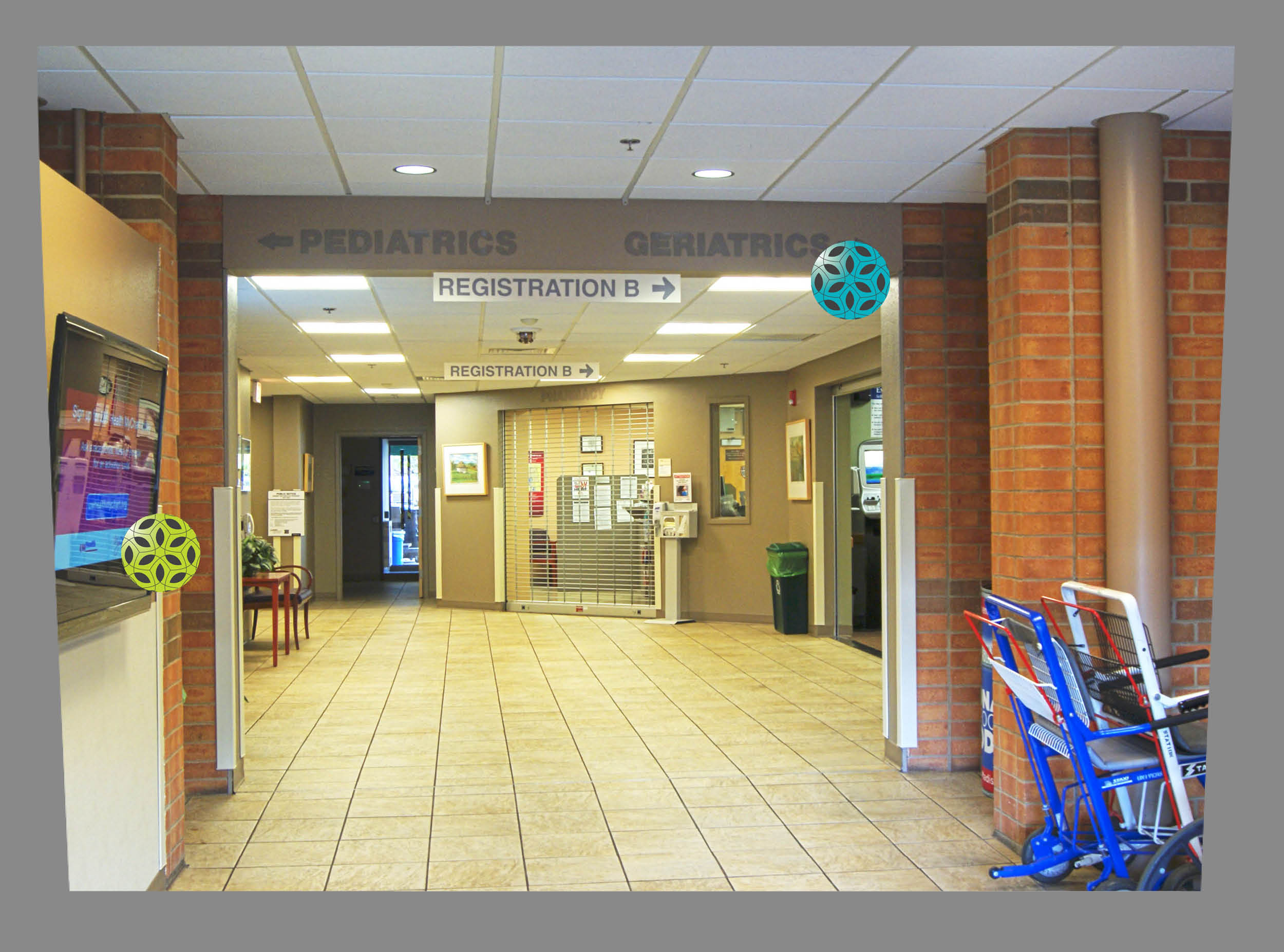
This screen extends too far into the path of travel.
![]()
This wayfinding is too low contrast and is not repeated at eye level.
![]()
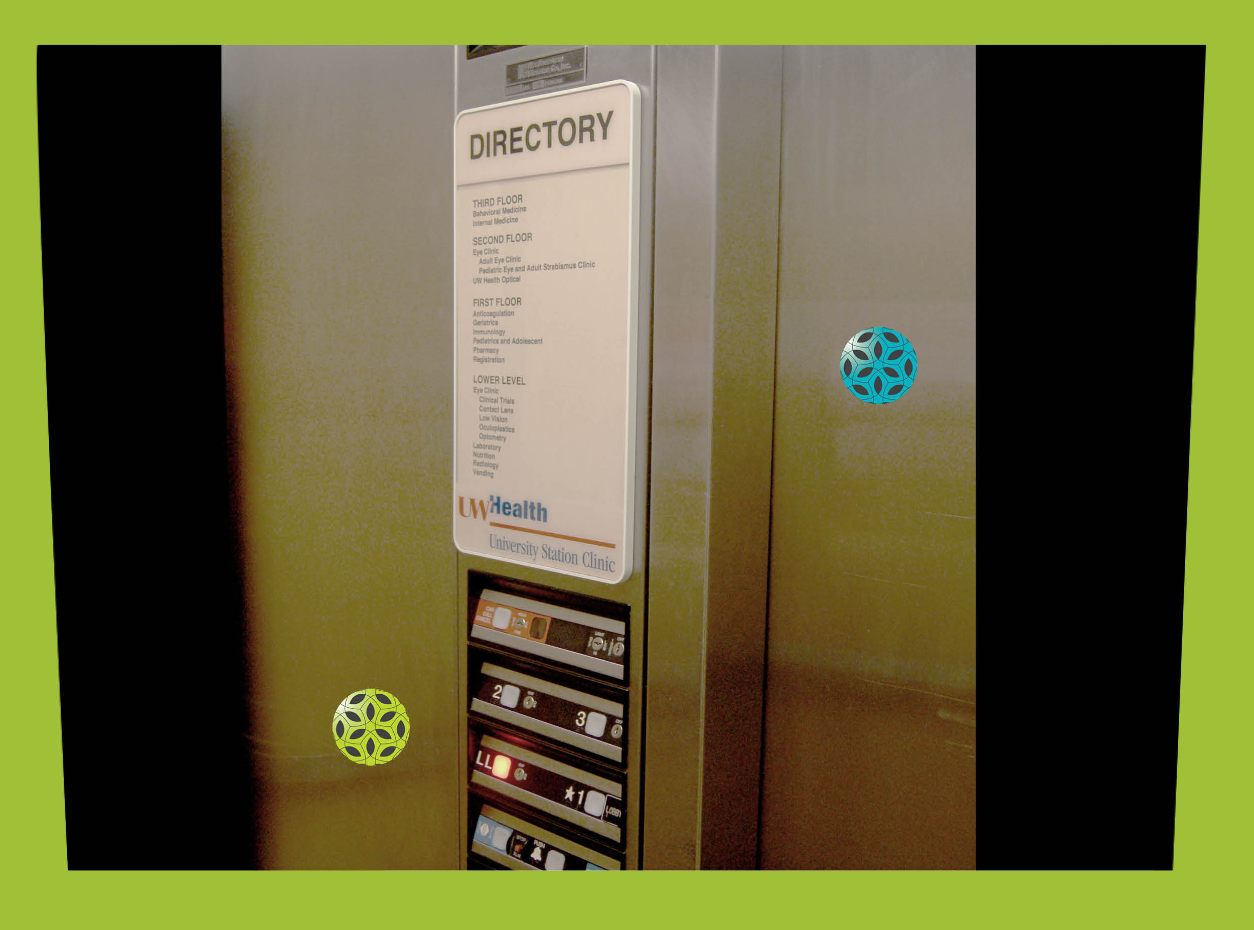
These elevator buttons light up and clearly contrast with their background.
![]()
The brushed finish on the elevator cab helps diffuse the lighting.
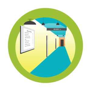
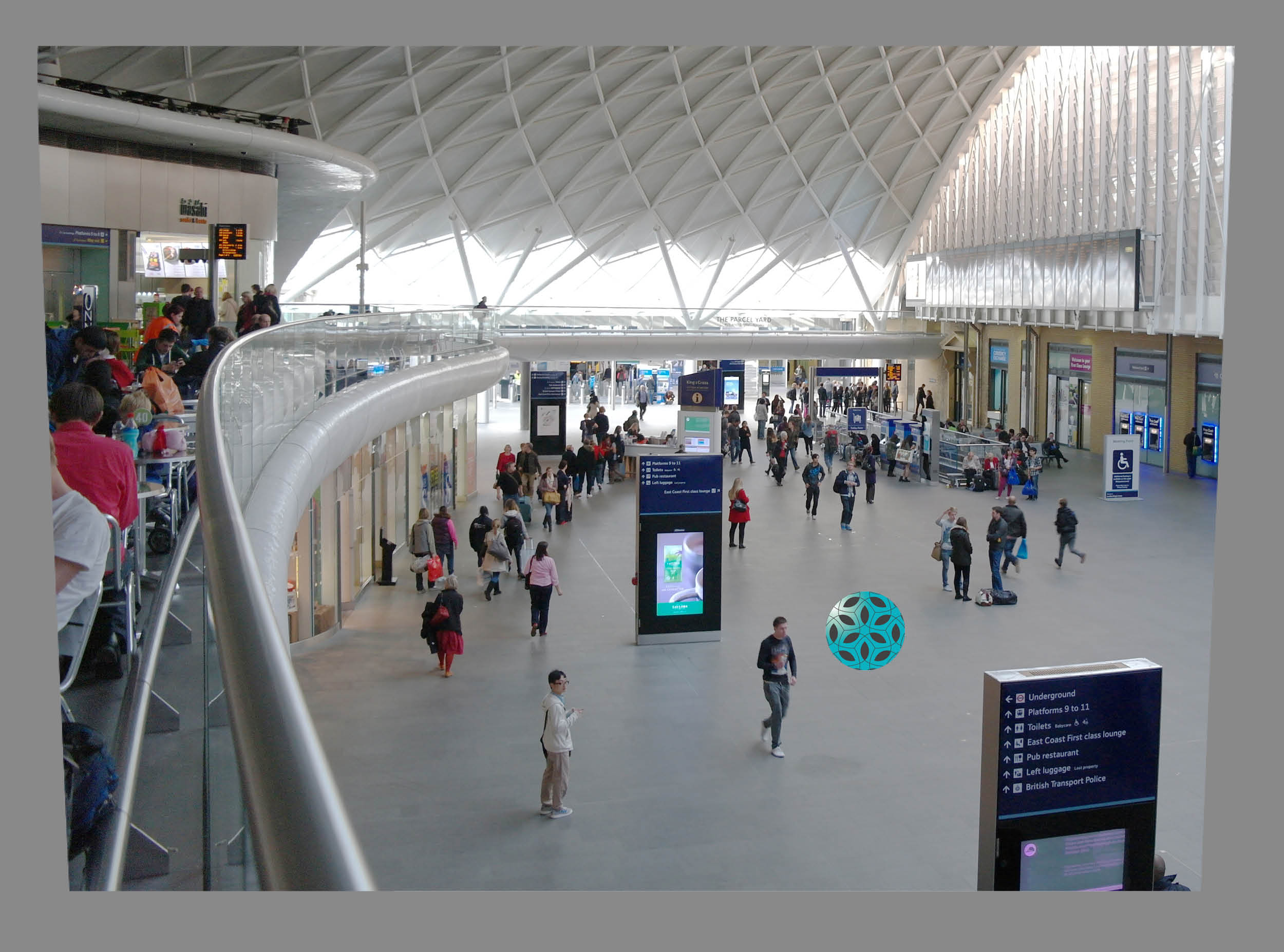
Wide open spaces can be an intimidating spaces to navigate. Reception desks and elevators are often too far away from the entrance to see. Luminance levels may be dramatically different making it difficult for the eyes to adjust and see obstacles. A lack of landmarks to aid in spatial orientation make them nerve racking experience to move through them.
Lack of identifying features can reduce the ability to sense relative position in space. Conversely, rows of cubicles, without unique features to signal location, can be disorienting. Low light levels and low contrast can blend obstacles in with their surroundings. ADA makes recommendations for protruding, wallmounted objects, but not for free-standing objects in open space.
![]()
This large atrium needs more differentiation between landmarks.
![]()
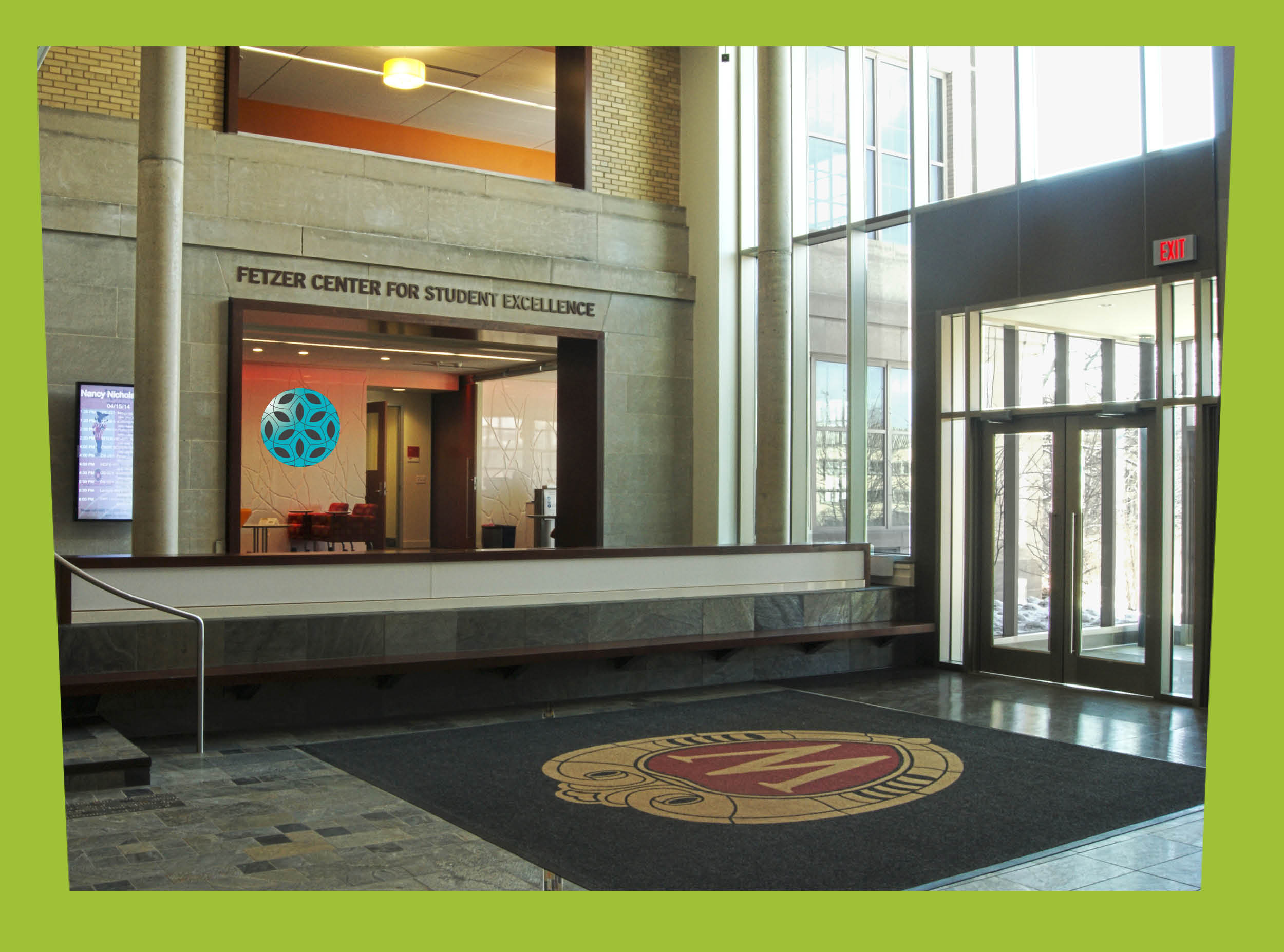
A reception, signage, and seating near the entrance allows users to gain their bearings.
